Why Do Colors Look Different on Clear and Metallic Labels?
- Home
- Blog
Why Do Colors Look Different on Clear and Metallic Labels?
Clear, Ultra Clear, and metallic labels offer a premium appearance, modern design, and a striking visual impact on product packaging. However, many brands notice that printed colors look different from what they saw on screen or in the original design.
So, what causes this difference?
This difference is usually not caused by print quality issues. Instead, it results from how label materials interact with light and underlying surfaces. For accurate and consistent color reproduction, the use of a white ink layer plays a critical role.

Why Does Color Perception Change on Clear and Metallic Surfaces?
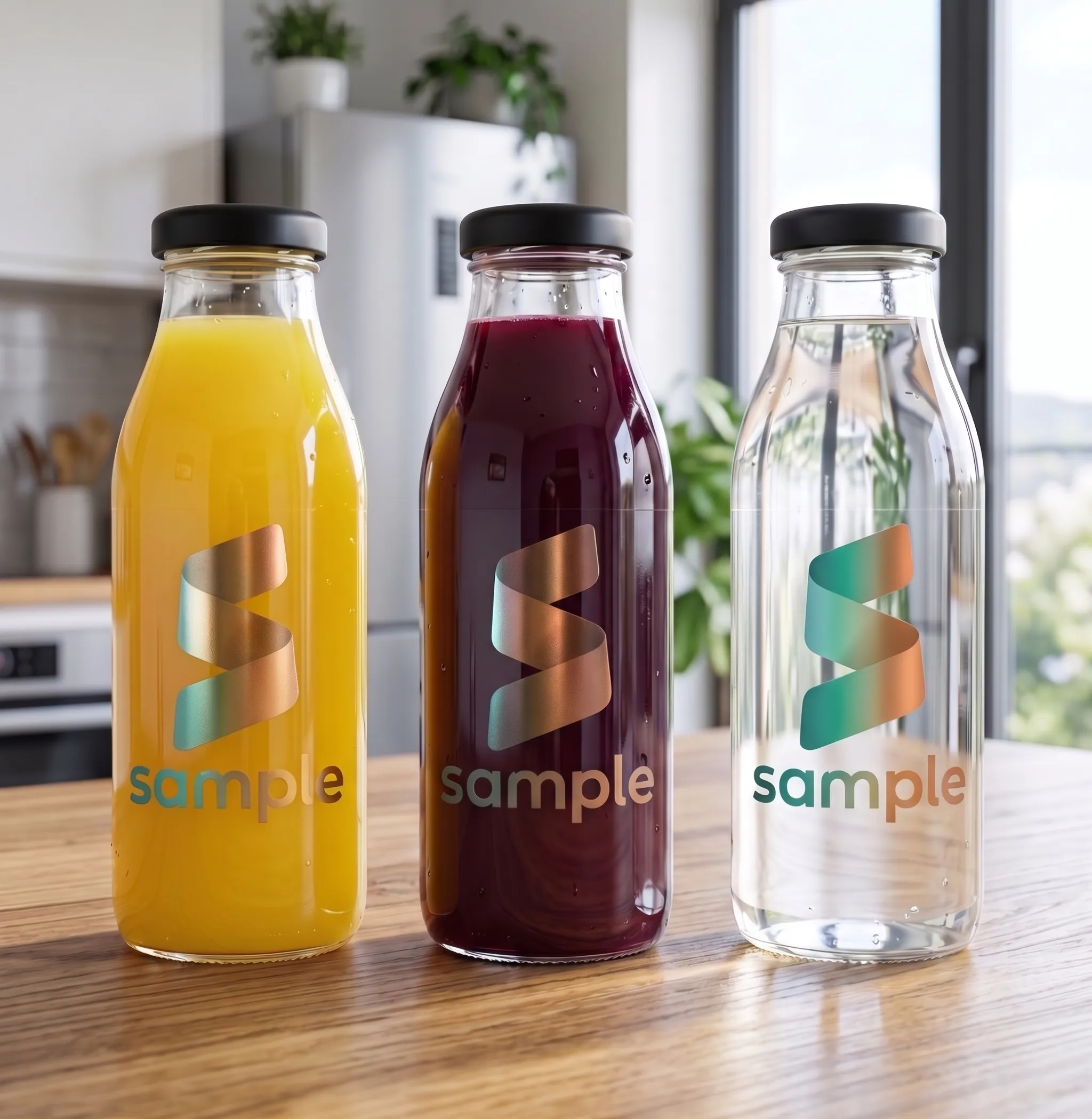
Clear labels allow the color of the packaging to remain visible, making them ideal for glass, PET, and transparent containers.
However, printed colors are semi-transparent by nature. The color of the surface behind the label can directly affect how the printed color is perceived.
For example:
• Blue ink applied to a yellow product may appear different than expected.
• Bright colors can look less vibrant on dark-colored packaging.
• Light tones may appear weaker than expected.
With metallic labels, color perception is influenced by the reflective properties of the material. Metallic surfaces behave differently from standard white substrates and can alter the appearance of printed colors.
For example:
• Colors printed without a white ink layer may take on a metallic appearance.
• Light shades may disappear on metallic surfaces.
• Brand colors may appear darker or slightly different than intended.
• Fine details and small text may lose visibility if sufficient contrast is not achieved.
For this reason, color management on clear and metallic labels requires a different approach than standard paper labels, and material characteristics should always be considered before printing.
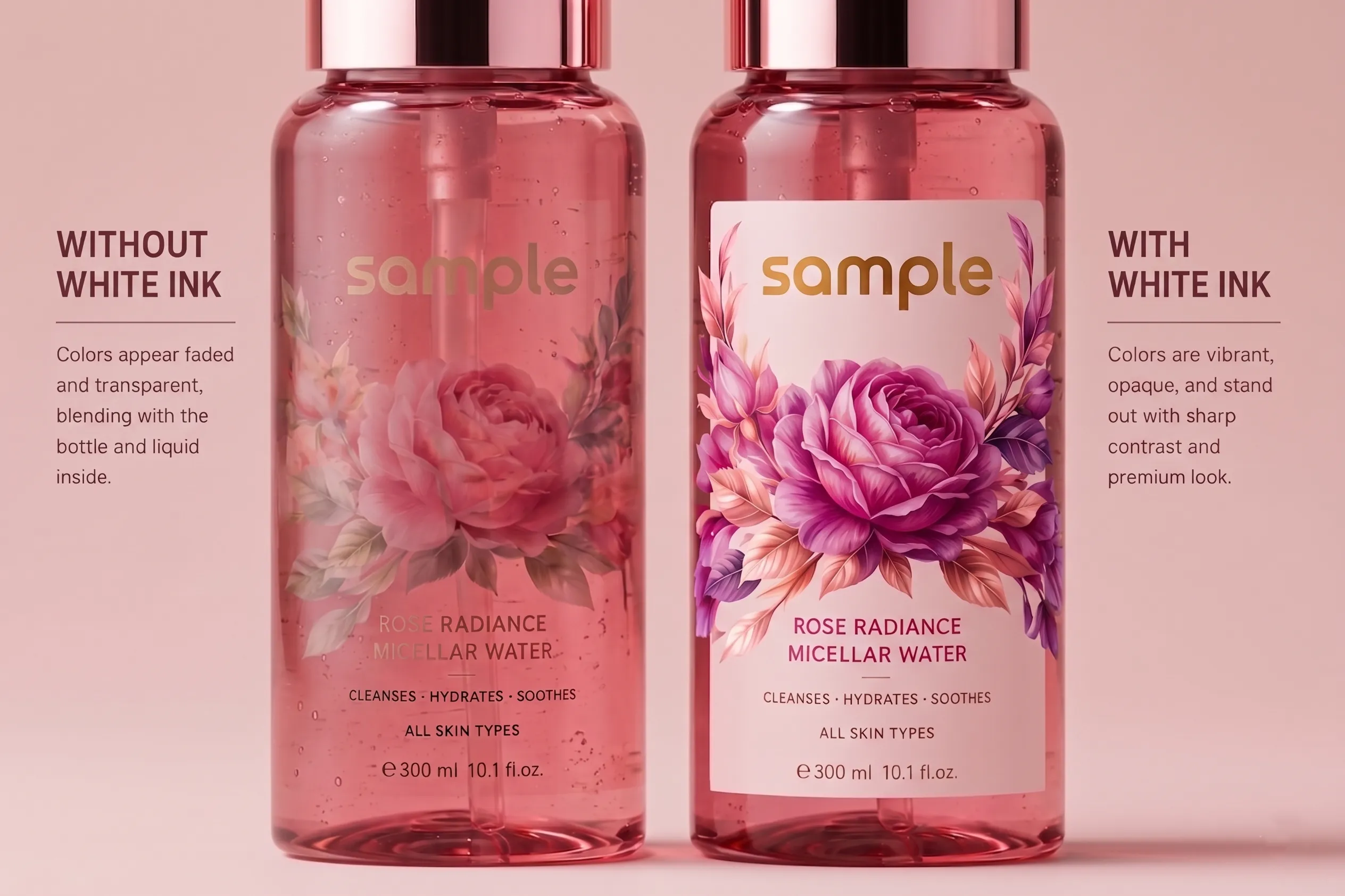
The Role of White Ink in Ultra Clear Labels
Ultra Clear labels are designed to create a "no-label look" by blending seamlessly with the packaging. This effect is widely used in cosmetic, personal care, beverage, and premium food packaging.
However, due to the high transparency of the material, printed colors are strongly influenced by the surface underneath.
A white ink layer helps:
• Enhance color vibrancy.
• Preserve brand colors more accurately.
• Increase contrast within the design.
• Improve the readability of text and logos.
Without a white ink layer, light colors and fine design elements may lose clarity or disappear entirely.

How to Achieve Accurate Colors on Clear and Metallic Labels
A white ink layer is an important printing technique that improves color accuracy and visual clarity on clear and metallic surfaces.
When strategically applied, it can:
• Reinforce a high-quality and professional brand image.
• Help colors appear closer to their intended tones.
• Improve readability.
• Support a premium packaging experience.
In some designs, the white layer is applied beneath the entire artwork, while in others it is used only under logos, text, or selected graphic elements.
The right approach depends on the product, packaging color, and overall branding objectives.
Frequently Asked Questions
Do All Clear Labels Require White Ink?
Not always. However, white ink can significantly improve color accuracy and visibility depending on the packaging color and design.
Why Do Colors Look Different on Metallic Labels?
Because metallic surfaces reflect light, printed colors may appear different compared to the same colors printed on standard white substrates.
How Can Color Vibrancy Be Improved on Ultra Clear Labels?
A properly applied white ink layer helps colors appear more vibrant, saturated, and visually consistent.
Why Do Logos and Text Sometimes Look Faded on Clear Labels?
This usually happens when there is insufficient contrast between the print and the background surface. A white underprint layer can effectively solve this issue.

Conclusion
Clear, Ultra Clear, and metallic labels provide products with a premium appearance, but they also require a specialized approach to color management. Proper planning of the white ink layer helps preserve brand colors, improve readability, and ensure that the final printed result meets expectations.
In professional label production, achieving outstanding results depends not only on selecting the right material but also on implementing the correct printing strategy.
00+
Workers
00+
Projects
00+
Happy Customers
00+
Continent