How to Achieve Pantone Color Consistency with HP Indigo
- Home
- Blog
How to Achieve Pantone Color Consistency with HP Indigo
A brand’s colors are one of the most important elements of its identity.
Consumers often recognize a brand by its colors even before they notice its logo. A deep burgundy on a cosmetic label, a distinctive navy blue on a premium beverage, or a characteristic green used by a food brand can become part of the brand’s visual memory over time. For this reason, noticeable color variations between different production runs are not merely aesthetic issues; they can also affect brand perception and product consistency on the shelf.
The Pantone Color System helps brands standardize specific colors. However, specifying a Pantone code in a design file does not guarantee that the color will appear exactly the same on every substrate and in every print run.
HP Indigo technology offers advanced color management capabilities. Nevertheless, achieving consistent color reproduction requires the combined management of Pantone specifications, substrate selection, white ink application, calibration, color measurement, and production standards.
In this article, we explore how Pantone color consistency can be achieved with HP Indigo and the key factors that influence the final result.

What Is the Pantone Color System?
Pantone is a globally recognized color communication system that assigns standardized codes to specific colors.
When designers, brand owners, and print service providers reference the same Pantone code, the target color can be defined more accurately and consistently. This is particularly important for corporate brand colors that must remain consistent across multiple production runs and different manufacturing partners.
However, a Pantone code only defines the target color. Several variables influence the final printed result, including:
* Label substrate
* Printing technology
* Ink formulation
* White ink application
* Color profiles
* Calibration status
* Finishing processes
* Color tolerance levels
For this reason, Pantone color management should be viewed as a complete production process rather than simply selecting a color code.
Why Do Colors Look Different on Screen and in Print?
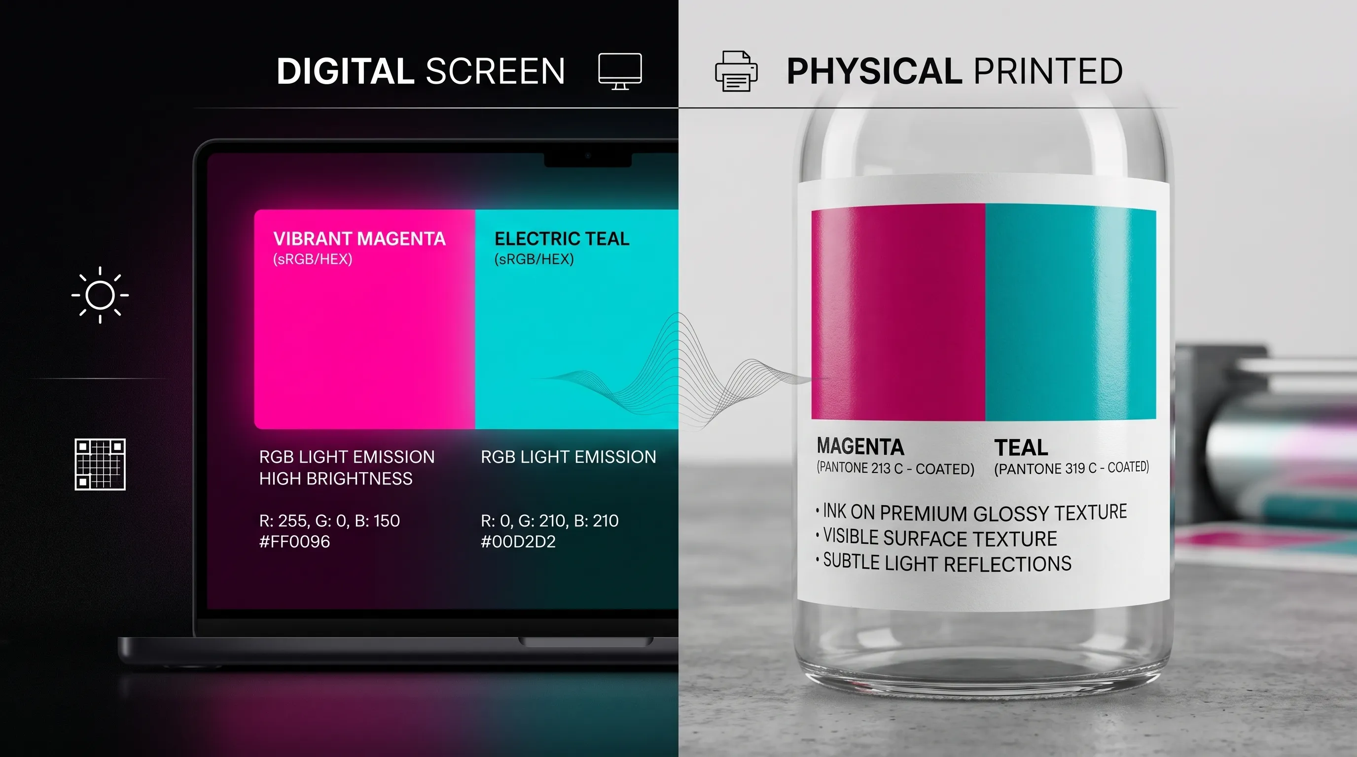
One of the most common causes of color variation is the difference between display technologies and printing technologies.
Computer monitors and mobile devices use the RGB color model, which generates color through light. Printed labels, on the other hand, rely on ink and reflected light.
As a result, a color displayed on a screen cannot always be reproduced identically on a printed label.
For more accurate color evaluation, it is recommended to use:
* An up-to-date Pantone guide
* A calibrated monitor
* Appropriate ICC profiles
* Printed samples on the actual substrate
* Instrument-based color measurements
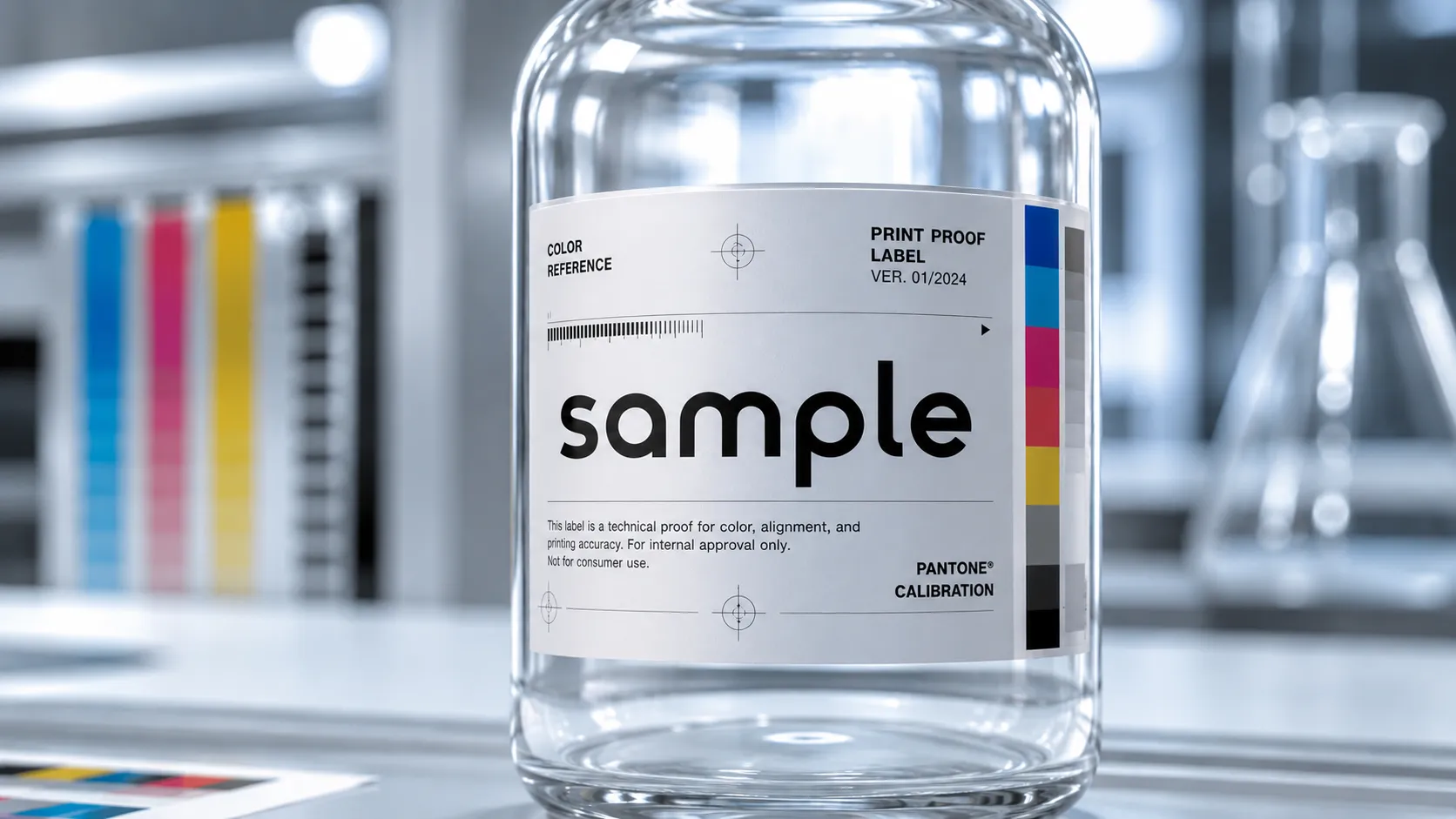
How Does HP Indigo Reproduce Pantone Colors?
HP Indigo presses can reproduce Pantone colors using several different approaches.
CMYK Simulation
Many Pantone colors can be reproduced by combining cyan, magenta, yellow, and black inks in specific proportions.
This method is cost-effective and suitable for a wide range of commercial applications. However, certain highly saturated colors—such as bright oranges, intense purples, certain corporate reds, and fluorescent colors—may be difficult to reproduce accurately within the standard CMYK color gamut.
Extended Color Gamut Printing
HP Indigo's Extended Color Gamut (ECG) technology expands beyond standard CMYK by adding additional process colors.
This approach can provide significant advantages for:
* Vibrant brand colors
* Designs containing multiple Pantone colors
* Applications with strict color requirements
* Consistent multi-SKU label production

Custom Spot Colors
For some brands, precise color reproduction is critical.
In such cases, custom spot colors may be considered to achieve tighter color tolerances and greater consistency across production runs.
Key Steps for Achieving Pantone Color Consistency
1. Define the Correct Pantone Color
Color consistency begins with selecting and communicating the correct Pantone code.
Descriptions such as “brand red” or “similar to a previous label” are not sufficient. The exact Pantone reference and corresponding color library should be clearly specified.

2. Select the Label Substrate Early
The same color can appear different on different substrates.
Coated paper, white polypropylene, clear films, and metallized materials all affect the appearance of printed colors.
For this reason, color approvals should be performed on the actual production substrate whenever possible.
3. Manage White Ink on Clear and Metallized Materials
The background color of clear or metallized substrates can significantly influence the final appearance of printed colors.
White ink can help create a more controlled printing surface by:
* Increasing opacity
* Reducing substrate influence
* Improving color consistency
* Producing more predictable color results
* Creating selective metallic effects when required
4. Use Appropriate ICC Profiles
ICC profiles help ensure accurate color communication between devices and production environments.
Using profiles that do not match the press, substrate, or print conditions can lead to unwanted color variations.
5. Perform Regular Press Calibration
Color consistency depends not only on design preparation but also on maintaining the printing system within defined specifications.
Regular calibration helps ensure that color output remains aligned with established standards.
Calibration becomes particularly important after:
* After maintenance
* After substrate changes
* During long production runs
* For repeat orders
6. Measure Color Objectively
Visual evaluation alone is not sufficient for professional color management.
Spectrophotometers are used to objectively measure the color difference between the printed result and the target reference. This allows color differences to be quantified and controlled using objective data rather than subjective perception.
7. Approve Printed Samples
For color-critical projects, printed samples should be produced on the actual substrate before full-scale production.
Sample approval helps evaluate:
* Color accuracy
* White ink performance
* Lamination influence
* Final appearance on the product packaging
8. Establish a Repeat Order Standard
One of the strongest indicators of effective color management is the ability to reproduce the same color consistently across future orders.
To achieve this, key production parameters should be documented, including:
* Pantone references
* Substrate specifications
* ICC profiles
* Color measurement data
* Ink configurations
* Approved production samples
This documentation helps ensure predictable results over time.
What Information Should Customers Provide Before Production?
To improve color accuracy and streamline the production process, customers are encouraged to provide:
* Exact Pantone references
* Current artwork files
* Brand guidelines
* Previously approved samples
* Product packaging specifications
* Preferred label material
* Surface finish requirements
* Clear or metallized substrate requirements
* Acceptable color tolerance levels
Providing this information early in the process can significantly improve color consistency and production efficiency.
Frequently Asked Questions
Can HP Indigo match every Pantone color exactly?
Not necessarily. The achievable result depends on the press configuration, substrate, ink set, and acceptable color tolerance.
Is providing a Pantone code enough?
No. Substrate selection, finishing processes, and physical color references should also be considered.
Why does the same Pantone color look different on different materials?
Because substrate properties such as whiteness, gloss, transparency, and surface texture influence the way colors are perceived.
Can Pantone colors be printed on clear labels?
Yes. However, white ink may be required to achieve greater opacity and color consistency.
How can color consistency be maintained for repeat orders?
By documenting approved production standards, color measurements, substrate specifications, and printing parameters.
Conclusion
Achieving Pantone color consistency with HP Indigo involves much more than selecting the correct color code.
Consistent results require proper substrate selection, suitable color reproduction methods, white ink management, ICC profiling, regular calibration, color measurement, and standardized production processes.
For brands with strict color requirements, consistent color reproduction is not only a matter of print quality but also a critical part of maintaining brand identity and recognition.
Continuing the HP Indigo Digital Printing Center Series
HP Indigo technology offers advantages that go beyond print quality. It also supports advanced color management, product traceability, personalization, and operational efficiency.
In our previous article, “Variable Data Printing with HP Indigo: From Traceability to Marketing,” we explored how variable data printing supports product tracking and personalized marketing initiatives.
In our next article, we will examine the operational and cost advantages of short-run label production with HP Indigo.
Protect Your Brand Color Standards
Maintaining consistent brand colors across different production runs and label materials is a key part of preserving brand integrity.
At Sancak Etiket, we evaluate your artwork, substrate selection, packaging structure, and application requirements to develop the most suitable color management approach for your project.
Contact us today to learn how HP Indigo technology can help you achieve consistent, repeatable, and reliable color reproduction across every production run.
00+
Workers
00+
Projects
00+
Happy Customers
00+
Continent